Thursday, December 18, 2008
Mid Term
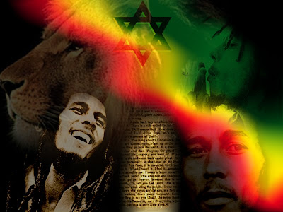
The mid term is a collage made up of several different images. It has many layers and different blending modes. There is also a lot of transparency in this projcet. The theme is Bob Marley and the elements used represent my view of him and Rastafarianism. I won't go into too much detail here. Instead, I'll let you figure out how everything was done...
Lesson 7 - Typography
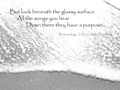
The background picture was taken on a beach in Half Moon Bay. The lyrics are from The Pharmacists song "Biomusicology." I felt that the text and the picture go well together in terms of style and message. The typeface is Papyrus and there are actually two layers of it. The top layer has a dropshadow to make it pop a little more and a slightly lower opacity. The second layer is done in screen mode to add a slight pattern. The background image has only had level adjustments before a gentle gaussian blur was applied to it.
Wednesday, December 17, 2008
Lesson 5 - Masks
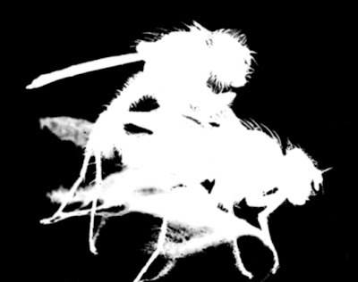
This is an image I created using Photoshop's masks. I followed the tutorials (mask video: part 1, mask video: part 2, mask video: part 3), but found them to be of little help in this case. Since then I have found a new technique for masking hair, or very fine detail out (Selecting & Extracting Hair), the catch is you need to have a white background. I guess you could say that I chose a poor image to start with, but I wanted to challenge myself.

The mask:
Wednesday, November 5, 2008
Lesson 4 - Colorizing
Colorizing is a technique similar to duotone except you are imposing a gradient upon the image, rather than a set of two colors.

This is an image from the tutorial cd I colorized. I used a fairly simple gradient with a white cream and reddish brown. I like how the background is slightly washed out, while her face retains a lot of detail.

This was also created from images on the tutorial cd. I layered the butterfly wing and fireworks images with a screen mode on the fireworks if I remember correctly. This caused the black night sky of the fireworks to become transparent. After that, I applied a gradient that included colors from the fireworks and butterfly wing. I feel that it still retains the traditional monarch butterfly's orange and black colors, while making them appear to explode with reds and yellows you'd see in fireworks.
Matthew Williams
Lesson 3 - Duotones
Duotone is both a type of printing as well as a generic term for color separated and sepia toned images. The origins of duotone printing are from printers that used two different ink colors, one of which was usually black. It was an addition to halftone printing and allowed an image to have color without increasing production costs. Most color newspaper, magazine and comics are printed in the same halftone format except they use several additional colors. Since prints are done in cyan magenta yellow and black those are usually the colors chosen.
In digital imaging there are many ways to separate color, but duotones are one of the most popular. This might be because they can imitate be used to imitate traditional black and white images or sepia toned images. One reason that many digital photographers like to use duotone printing is that it can actually improve the quality of a photo they wish to print in black and white. This is because most desktop printers cannot accurately print as many levels of black as photoshop can calculate. The addition of another color allows the printer to make images look much smoother and more accurate. The choice of color to use can also give the image a distinct feel, or style. For example I found that the addition of a light beige/brown to black gave me a realistic sepia toned image. Duotone can also make a convincing monochrome image on a desktop if a dark blue is chosen.
In digital imaging there are many ways to separate color, but duotones are one of the most popular. This might be because they can imitate be used to imitate traditional black and white images or sepia toned images. One reason that many digital photographers like to use duotone printing is that it can actually improve the quality of a photo they wish to print in black and white. This is because most desktop printers cannot accurately print as many levels of black as photoshop can calculate. The addition of another color allows the printer to make images look much smoother and more accurate. The choice of color to use can also give the image a distinct feel, or style. For example I found that the addition of a light beige/brown to black gave me a realistic sepia toned image. Duotone can also make a convincing monochrome image on a desktop if a dark blue is chosen.

This image is a duotone created from two seperate images I found on the internet. I made a few color and level adjustments to the background image of the rainforest, but it's original other than that. I then cut out the girl with the umbrella from another image using the magnetic lasso, and magic wand primarily. I tried to use the refine edge and feather tools to give the edge a softer quality, but wasn't satisfied. I ended up using a soft edge eraser on the forground layer by hand, erasing to a transparent background. I was able to give it a soft uniform edge, without the unreaslistic feathering created by the refine edge and feather options. At this point I adjusted the levels, brightness and contrast on the forground to more closely match it to the background enviornment. Once I was satisfied with the compositing I went on to create the duotone by first converitng the image to grayscale and then to duotone. I chose a teal and brown color set for my duotone and adjusted the contrast, color balance and levels accordingly. I thought of going back and adding some shadows to the umbrella, but for now I am happy with the results.
Matthew WilliamsLesson 2
After using the resize tool in Photoshop I found that changing the size of photo's is relatively easy once you know how it works. There are several different options within the dialog box that cause very different results. The constrain proportions box is important because it can maintain the aspect ratio of a picture, or allow you to change the proportions. The exact dimensions of a picture can be precisely controlled by either entering the desired height and width in pixles or in inches/centimeters. The resolution is the amount of pixles in one inch and that can also be controlled, causing either the image to become smaller. You can even resize an image in terms of percent. When you resize an image it reduces the quality, depending on how much it is resized. The type of resampling you choose also affects the quality of the image.
I like using the magic wand for selections because it is easy to use and is very controllable. The tolerance control allows you to select regions of color either large or small and the anti-alias feature creates smoother transitions. I find that the quick selection tool would be a good choice in an area where there is mottling in the background, but an easy to isolate area you would like to select. The brush type of selection is very interesting and the tool generally calculates your desired selection correctly. If there is a lot of detail however, I do still prefer the magic wand. The lasso tool is a good choice when there is a large area to select, but there are many color differences inside and out, and there are straight sides. If there is a strong border between the two, the magnetic lasso is perfect and can be improved by simply clicking the image to set a point. Circles, ellipses and rectangles or squares are very easy to do and pretty mch self explanitory. Using paths to select is probably the most difficult way to select and for me, is usually not my first choice. Whatever selection tool you use it is very easy to add or subtract from selections using the shift and control keyes. This conviniently allows you to use multiple tools to get one selection very accurate.
Matthew Williams
Introductions...
Hi, my name is Matthew Williams and I am a student at West Valley College. This blog was made to host some of the images I created for my Photoshop class. I have been working with Photoshop for a few years and have the basics down. I am mainly taking the class to learn different techniques and workflows as well as to increase my proficiency in the techniques I am already familiar with. I look forwad to learning a lot in this class.
Subscribe to:
Posts (Atom)